Colour is one of the quickest shortcuts to feeling — it steers perception, creates mood and helps people recognise a brand. In this piece we unpack why colour psychology matters, how different hues trigger emotional responses, and how cultural context changes meaning. You’ll get practical insight into how to select and apply colour for stronger brand identity, plus examples of how EyeMedia Studios uses these principles in our photography to make brands feel unmistakably themselves.
Colour psychology studies how colour affects human emotion and behaviour. In branding, those effects matter because colour choices shape first impressions, trust and purchase decisions. Brands that pick colours deliberately—matching hue, tone and saturation to their values—create clearer, more memorable identities that connect with the right people.
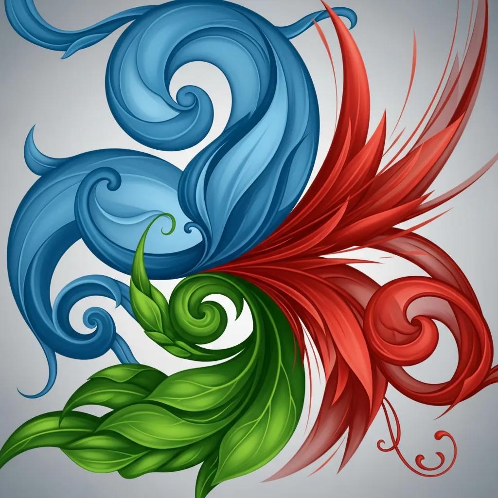
Colours carry associations that listeners and viewers read almost instantly. Blue often signals trust and reliability, which is why many financial and tech brands use it. Red can create energy and urgency, useful for promotions or products that sell on excitement. Choosing colours that align with your brand values helps guide how people feel about you before they even read a word.
Colour meaning shifts across cultures and contexts. White suggests purity and celebration in many Western traditions, but in some parts of East Asia it’s linked with mourning. Those differences matter for brands operating internationally: the same palette can invite very different reactions in different markets. Thoughtful brands test and adapt palettes so the visual language matches local expectations.
Applied consistently, colour becomes a brand’s visual shorthand. A reliable palette across web, print and photography builds recognition and emotional memory. That consistency supports everything from faster recognition in social feeds to clearer product differentiation on a crowded shelf.
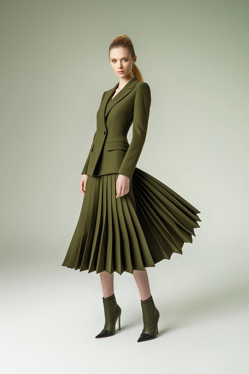
Colours communicate personality and promise. Green signals health or sustainability, blue suggests competence, and warm tones can feel energetic or friendly. When those associations line up with your messaging, colours reinforce meaning and help customers form a quick, accurate impression—leading to trust and repeat engagement.
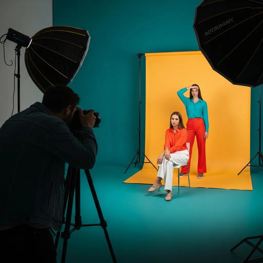
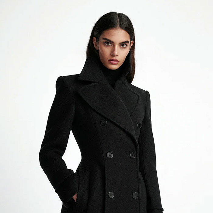
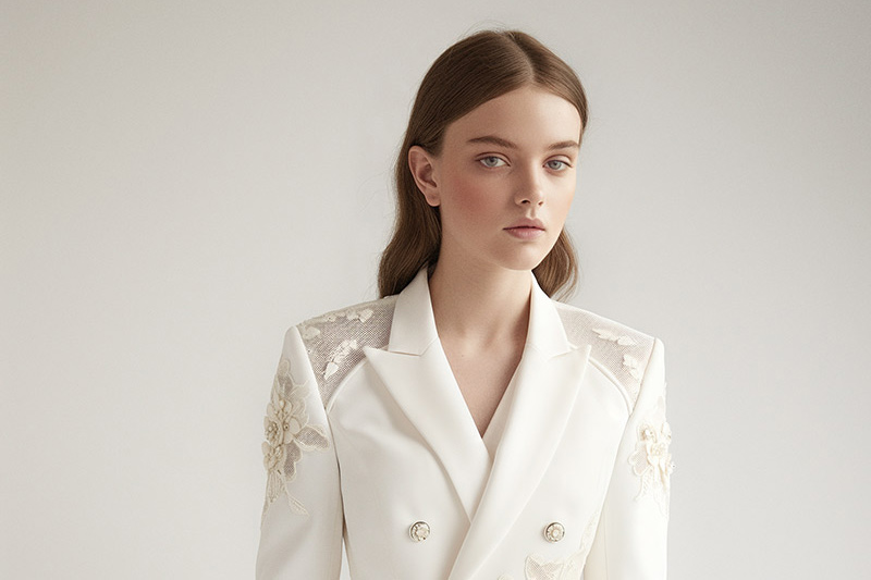
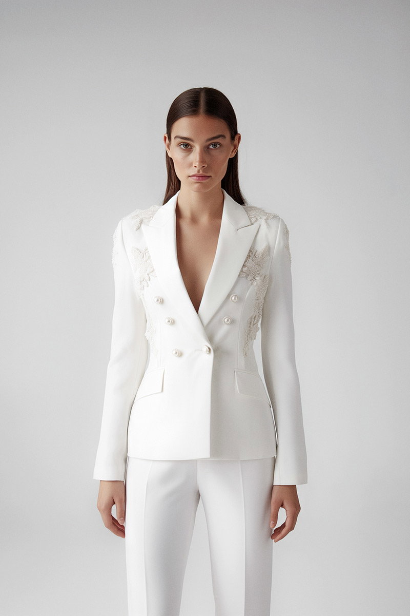
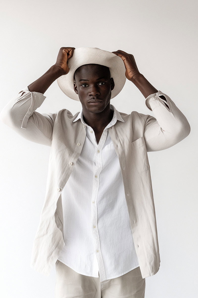
Photography is where palettes come alive. Lighting, styling and colour grading let us present a brand’s colours with precision and emotion — from subtle, trustworthy tones in headshots to bold, saturated scenes for product hero shots. At EyeMedia Studios we plan shoots around palette priorities so imagery reinforces, rather than conflicts with, your visual identity.
Certain hues reliably trigger specific feelings, which is why many brands lean on familiar colour cues. Below are common associations to consider when building a palette.
These pairings show how colour can work as a deliberate signal. Use them as a starting point, then refine tone, saturation and combinations to suit your brand story.
Blue tends to read as dependable and calm—ideal for finance, tech or services that rely on trust. Red reads as energetic and attention‑grabbing, useful for calls to action, food and entertainment. Green connects to nature, health and sustainability, which makes it a natural fit for eco and wellness brands. The precise shade and context will alter these impressions, so testing matters.
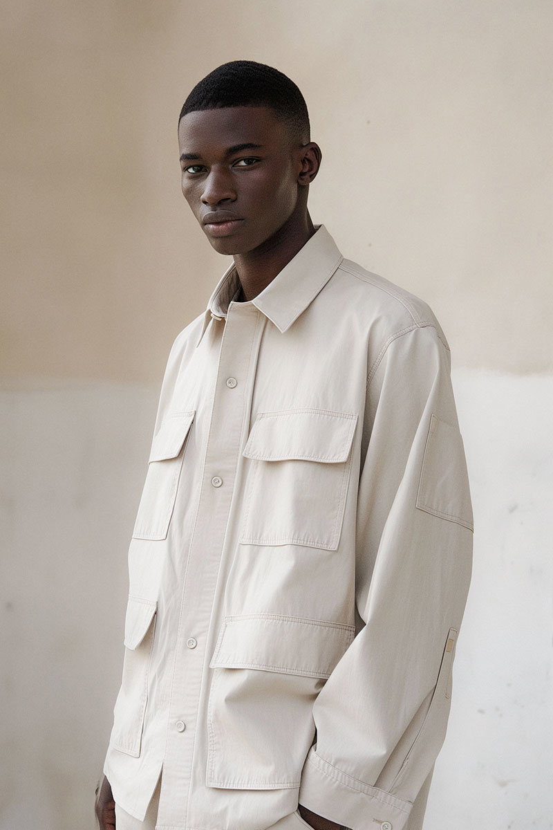
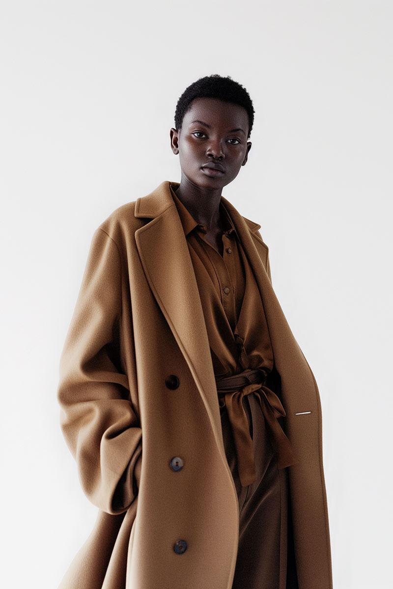
Industry norms and brand personality both shape palette decisions. Luxury brands favour deep blacks, golds or muted palettes to signal exclusivity; tech brands often choose blues and clean whites to feel modern and reliable. Your choice should balance category cues with what makes you distinct.
We use colour psychology to inform concept, styling and post‑production. That means choosing backgrounds, wardrobe and lighting that support your palette, and grading images so colours reproduce consistently across platforms. The result is photography that looks great and works strategically for your brand.
In headshots, a simple colour choice can change perception. Blues and neutral tones convey competence and reliability; warmer hues and softer contrasts make subjects feel approachable. We guide clients on clothing and backdrop choices so their headshots reflect the impression they want to make.
In e‑commerce, colour attracts attention and helps customers evaluate products quickly. Bright, saturated imagery can increase clicks for promotional items, while clean, accurate colour reproduction builds trust for product detail shots. We balance visual impact with faithful colour rendering to support conversion.
Colour trends are shifting with consumer values and tech capabilities. Expect more brands to use adaptive palettes, subtle earthy tones and combinations that signal sustainability while staying digitally vibrant, colors in business.
AI tools now generate palettes informed by data and audience preferences, letting brands trial dynamic colour systems that adapt by region, season or user behaviour. The advantage is personalisation at scale, but the challenge is maintaining a recognisable core identity across variations.
Consumers increasingly prefer brands that look and feel environmentally conscious. Organic, muted greens, warm neutrals and tactile textures signal sustainability in a way that feels authentic. When combined with transparent messaging, these palettes help brands demonstrate purpose visually.
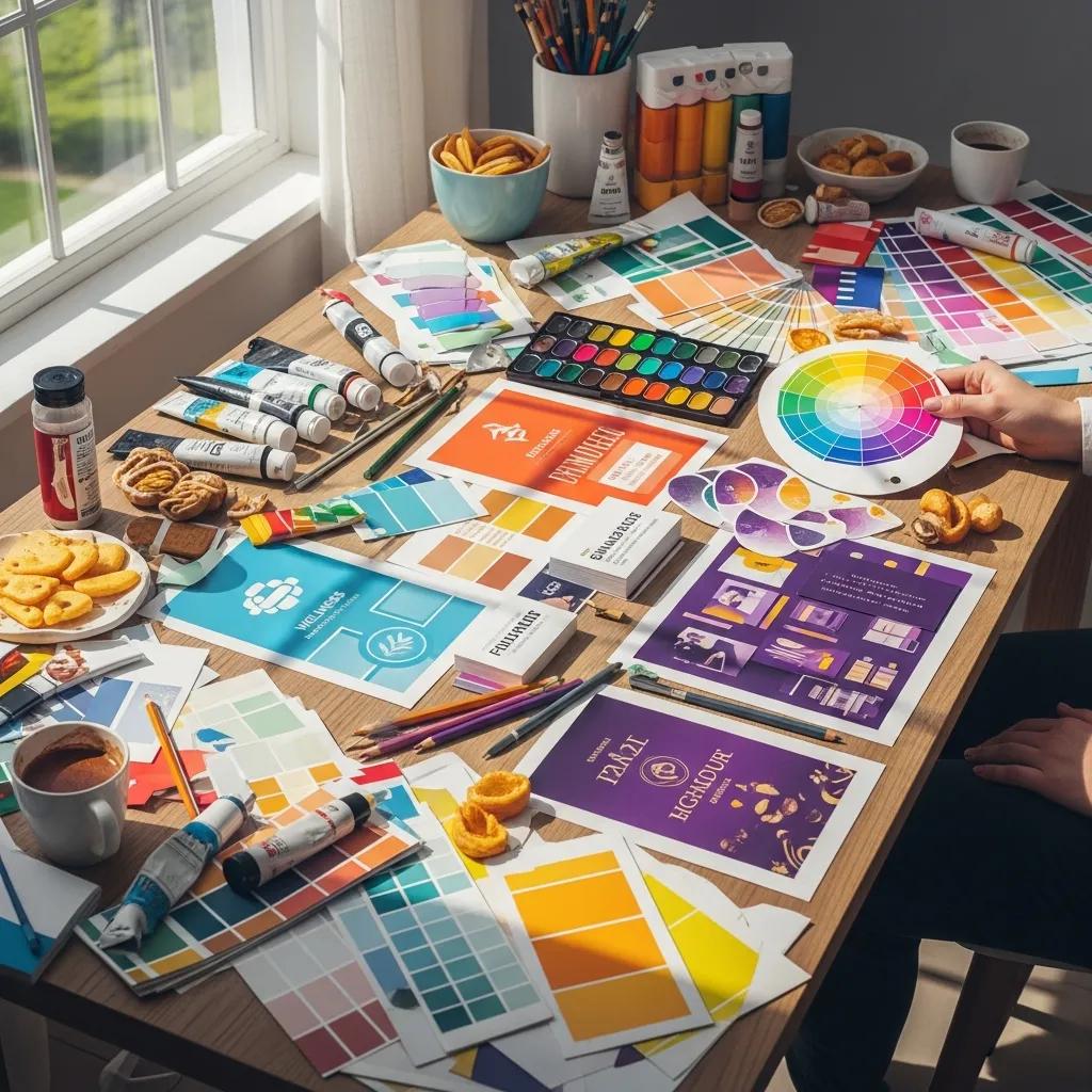
Choosing a brand palette is a strategic exercise, not a design whim. Consider who you’re speaking to, the feelings you want to evoke, and where your visuals will appear. Combine audience insight with category signals and then test iterations in real contexts.
Key considerations include your target audience, competitive landscape, cultural context and the emotions your brand needs to trigger. Also think about accessibility and contrast so your colours work for every viewer. These practical constraints often shape the final choices as much as aesthetics do.
Studying competitors shows you category conventions and gaps you can exploit. If everyone in your space uses blue, a distinctive but relevant alternate—different hue, texture or accent colour—can help you stand out while still signalling your category.
Warm colours (red, orange, yellow) tend to energise and create urgency or appetite—useful for food, entertainment and promotional messaging. Cool colours (blue, green, purple) calm and reassure, which suits finance, healthcare and professional services. The same colour can read differently depending on saturation, contrast and context and color association with emotions.
Combine qualitative and quantitative methods: A/B tests for CTAs and page elements, customer surveys for perception, and focus groups for cultural nuance. Track metrics like click‑through and conversion rates alongside brand recall to assess impact and emotional reactions.
Colour is a major recognition cue for logos. Consistent use of a palette builds memory and makes a logo more identifiable across touchpoints. The colour should complement the logo form and be flexible enough for different contexts (print, digital, environmental graphics).
Cultural context can flip a colour’s meaning—what feels celebratory in one region may feel inappropriate in another. Global brands either choose neutral palettes that translate well or adapt assets regionally to respect local associations, as colors in business.
Common errors include picking colours for personal taste rather than audience fit, ignoring accessibility and contrast, and using inconsistent palettes across channels. Another pitfall is misreading cultural meanings—test and validate before scaling a palette globally.
Emerging tech—AI palette generators, adaptive design systems and advanced colour management—lets brands experiment faster and personalise visuals to users. That creates opportunities for dynamic branding, but it also raises the need for clear rules so the core identity remains recognisable.
Colour is a strategic asset: used thoughtfully it speeds recognition, shapes feeling and strengthens loyalty. If you want photography that realises your palette and amplifies your brand story, EyeMedia Studios plans shoots and grades images with those goals front of mind. Get in touch to see how we can lift your visual identity through colour.