A visual brand style guide is the playbook that keeps your brand recognisable and consistent. It defines how your brand looks and behaves across channels, so every touchpoint feels intentional. In this practical handbook we cover why a style guide matters, the essential elements it should include, and how to put it into practice and keep it current. Brand inconsistency causes confusion and weakens recognition — a clear, well-structured guide prevents that. Here you’ll find a definition of a visual brand style guide, steps to shape your visual identity, the value of professional photography, best practices for imagery, and simple strategies for ongoing maintenance.
A visual brand style guide is a single reference document that defines a brand’s visual system — logos, colour palette, typography, imagery and supporting graphics. It’s the rulebook for anyone creating brand assets, ensuring visual communications are coherent and true to the brand. A consistent visual identity builds recognition and trust across platforms, making the guide one of the most practical investments in your brand toolkit.
By setting clear, usable rules — for logo placement, colour application, type hierarchy and image treatment — a style guide makes it easy for teams and partners to produce on‑brand work. When everyone follows the same visual language, the brand reads the same whether it’s seen on a website, a social post or printed collateral. That consistency strengthens brand recognition, encourages loyalty and reduces costly mistakes.
A brand book typically covers these essentials:
Together these components form a cohesive visual identity that reflects the brand’s purpose and personality.
Defining your brand’s visual identity starts with clarity about who you are and what you stand for. Those decisions should guide every visual choice, from colour to composition, so the final style guide feels authentic and useful.
Your mission, vision and values are the compass for visual decisions. They point to the colours, imagery and typography that will resonate with your audience — for example, a brand centred on sustainability will favour earthy tones and natural imagery. Aligning visuals with your core values makes your identity feel genuine and easier for people to connect with.
Choosing a colour palette and type is part psychology, part practicality. Colours carry emotional signals and influence perception; type affects readability and tone. Pick colours that evoke the feelings you want your audience to have, and choose typographic pairs that support legibility and personality — whether that’s modern and minimal or warm and approachable. Simple, considered choices are more memorable than overly complex brand design guidelines.

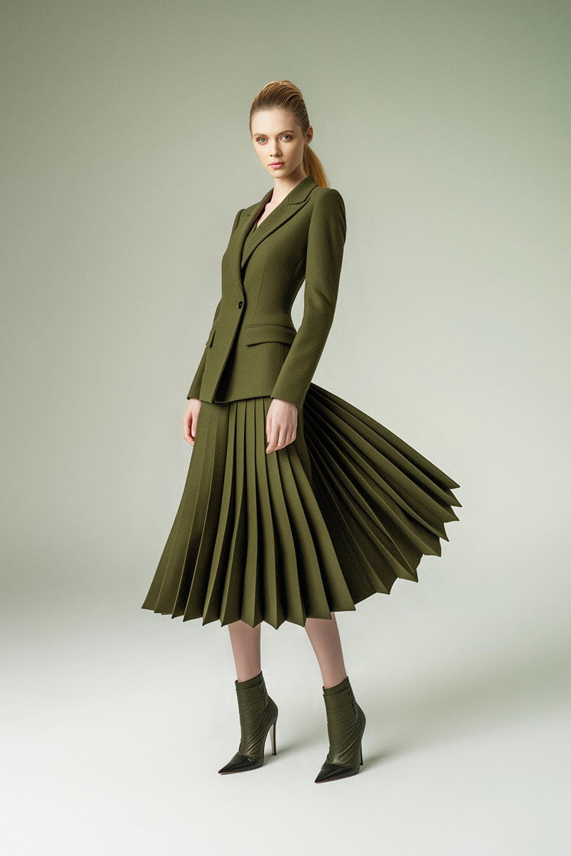
Professional photography lifts the whole visual system — it communicates quality, builds trust and gives your brand personality. Consistently styled imagery signals professionalism and helps audiences understand who you are at a glance.
Headshots and corporate photos humanise your brand and create a direct connection with your audience. Consistent, well-executed portraits and workplace imagery make your team feel approachable and reliable, and when used consistently they reinforce the brand’s visual language across channels.
A good corporate photography section should spell out style, composition and editing expectations. Typical guidance includes:
Clear photography rules make it easier for internal teams and external suppliers to deliver images that fit the brand.
Imagery and graphic elements should support the brand story, not compete with it. Define when to use photography, when to use illustration or icons, and how those elements interact with layout and copy to create a consistent visual rhythm.
To set practical photography rules, cover three areas:
Clear definitions here reduce ambiguity and make production faster and more consistent.
Graphic elements and icons act as visual shorthand — they clarify information, reinforce tone and make layouts more engaging. When designed to match your colour, scale and line style, icons and graphics strengthen the overall visual language and make communication clearer.
A living style guide is practical and adaptable: it’s used daily and updated as the brand evolves. Treat it as a working resource rather than a static PDF.
Keep your guide useful with a few straightforward habits:
Actively maintaining the guide ensures it remains a trusted tool rather than an ignored document.
Use the style guide as the single source of truth: make it easy to access, train teams on its use, and include examples for common scenarios. When designers, marketers and partners refer to the same guide, campaigns, materials and channels all present a unified brand that’s easier for audiences to recognise and trust.
A visual brand style guide focuses on the tangible visual rules — logos, colours, type, imagery and graphic elements. A brand book is broader: it includes the brand’s mission, vision, values and voice as well as the visual system. In short, the style guide is the visual subset of the brand book and is typically the tool teams use day to day.
Make the guide practical: write in plain language, divide it into clear sections, include visual examples and templates, and add a table of contents and FAQ for quick navigation. Test it with the people who will use it and iterate based on their feedback.
Avoid being overly prescriptive or too vague. Missing visual examples, neglecting updates and excluding key stakeholders are common pitfalls. Aim for clear, actionable rules and examples that anyone can follow.
Review it at least once a year, or whenever you make significant changes to your brand or offerings. Regular reviews, combined with team feedback, will keep the guide relevant and practical.
Absolutely. A style guide ensures social assets — profile images, post templates, tone, colour usage and typography — all align with the brand. Consistent social visuals strengthen recognition and make your content more instantly identifiable.
Audience research is essential: it reveals preferences, expectations and cultural cues that should inform your visual choices. When visuals are grounded in audience insight, the brand feels more relevant and engaging to the people you’re trying to reach.
A clear visual brand style guide is one of the simplest ways to make your brand feel consistent, professional and recognisable. By defining logos, colours, type, imagery and practical rules — and by keeping the guide up to date — you’ll strengthen recognition and build trust. Start shaping your brand’s visual identity today: use these principles and tools to create a guide that your team will actually use.