In a crowded market, a steady visual identity is often the difference between being noticed and being forgotten. This guide explains why visual identity matters, how clear visual guidelines keep your messaging consistent, and how professional photography ties it all together. You’ll get practical advice on building usable visual guidelines, see how cohesive imagery shapes customer perception, and learn what to expect when booking a brand shoot. By following these steps, businesses can make sure their visuals reflect their values and speak clearly to the people they want to reach.
Your brand’s visual identity is the set of visual elements that represent who you are — logos, colour palette, typography and imagery. It’s often the first thing people notice, so getting it right builds recognition and trust. A strong, consistent visual identity helps you stand apart from competitors and communicates your personality and values without words. When your visuals are aligned across channels, customers are more likely to recognise and stick with your brand.
Visual identity shapes first impressions and can steer buying decisions. Consistent visuals signal professionalism and reliability; inconsistent ones create doubt. Simple choices — like a steady colour palette and consistent type — make a brand feel dependable. Great visual systems also trigger emotional responses that deepen customer connection. Look at brands such as Apple or Coca‑Cola: their consistent imagery helps build strong, brand consistency relationships with customers.
A clear brand visual identity is built from a few essential parts:

Visual brand guidelines are the rulebook that keeps your brand looking like itself across every touchpoint. They don’t need to be long — they need to be clear, practical and easy for your team and partners to follow.
Creating useful guidelines usually follows a few key stages:
Guidelines give clear, repeatable instructions for visual decisions — from image composition to colour grading. When everyone follows the same rules, your marketing, social, web and printed materials feel like one coherent brand. That recognisability makes it easier for audiences to find, trust and remember you.

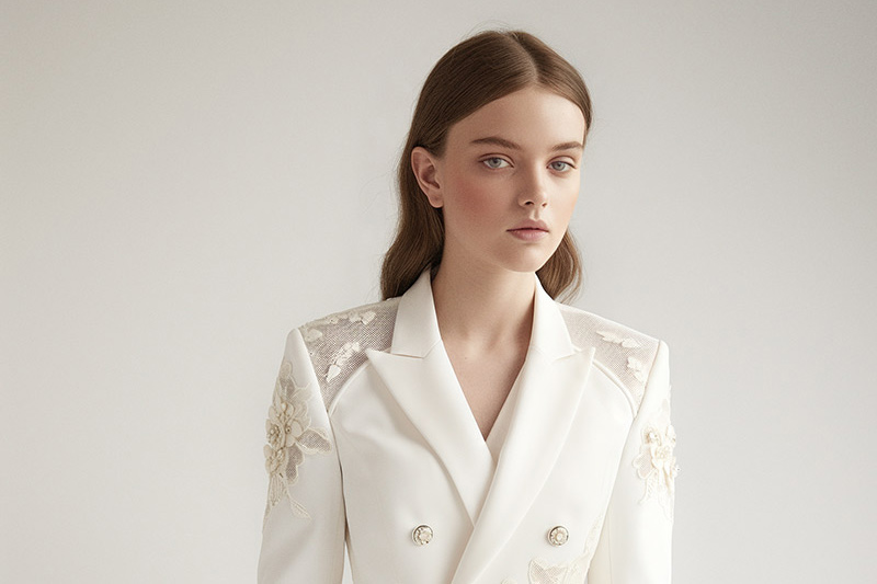
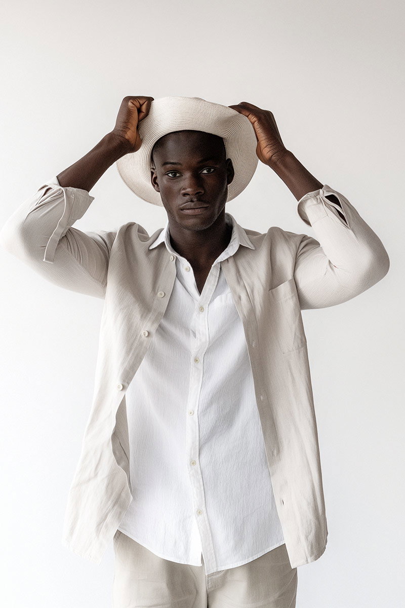
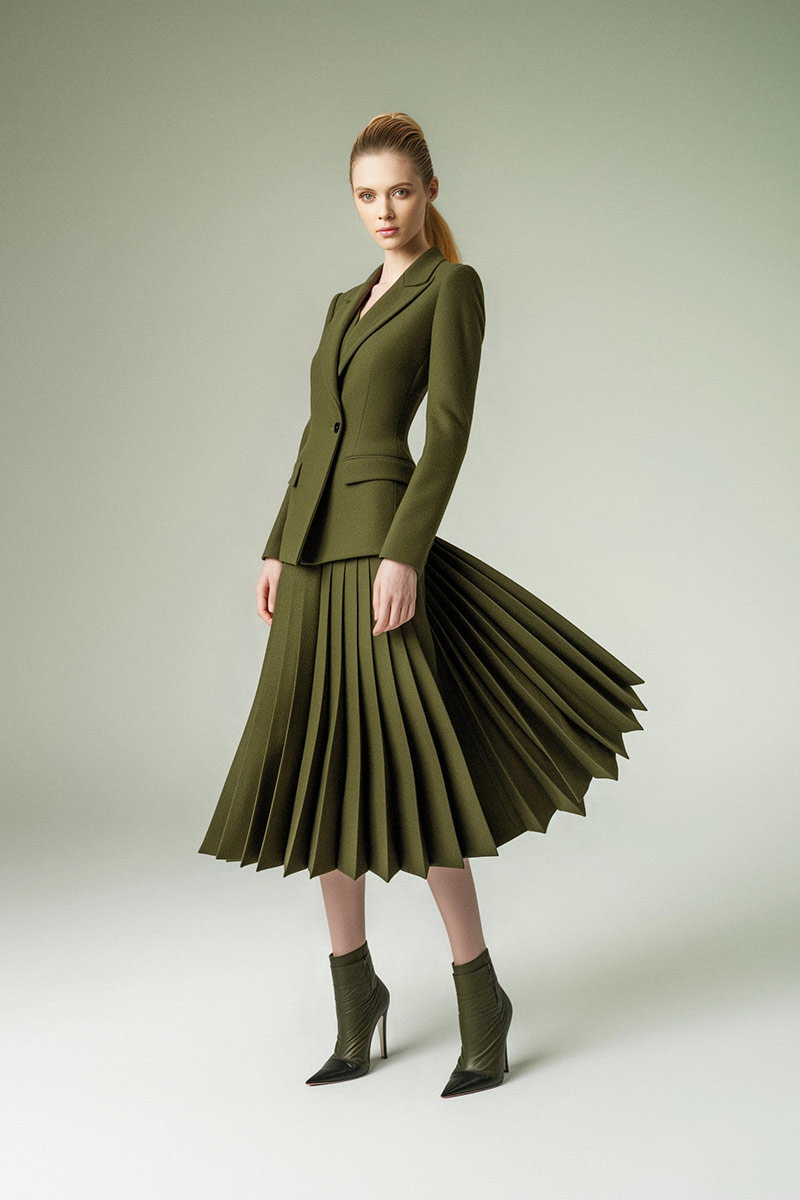
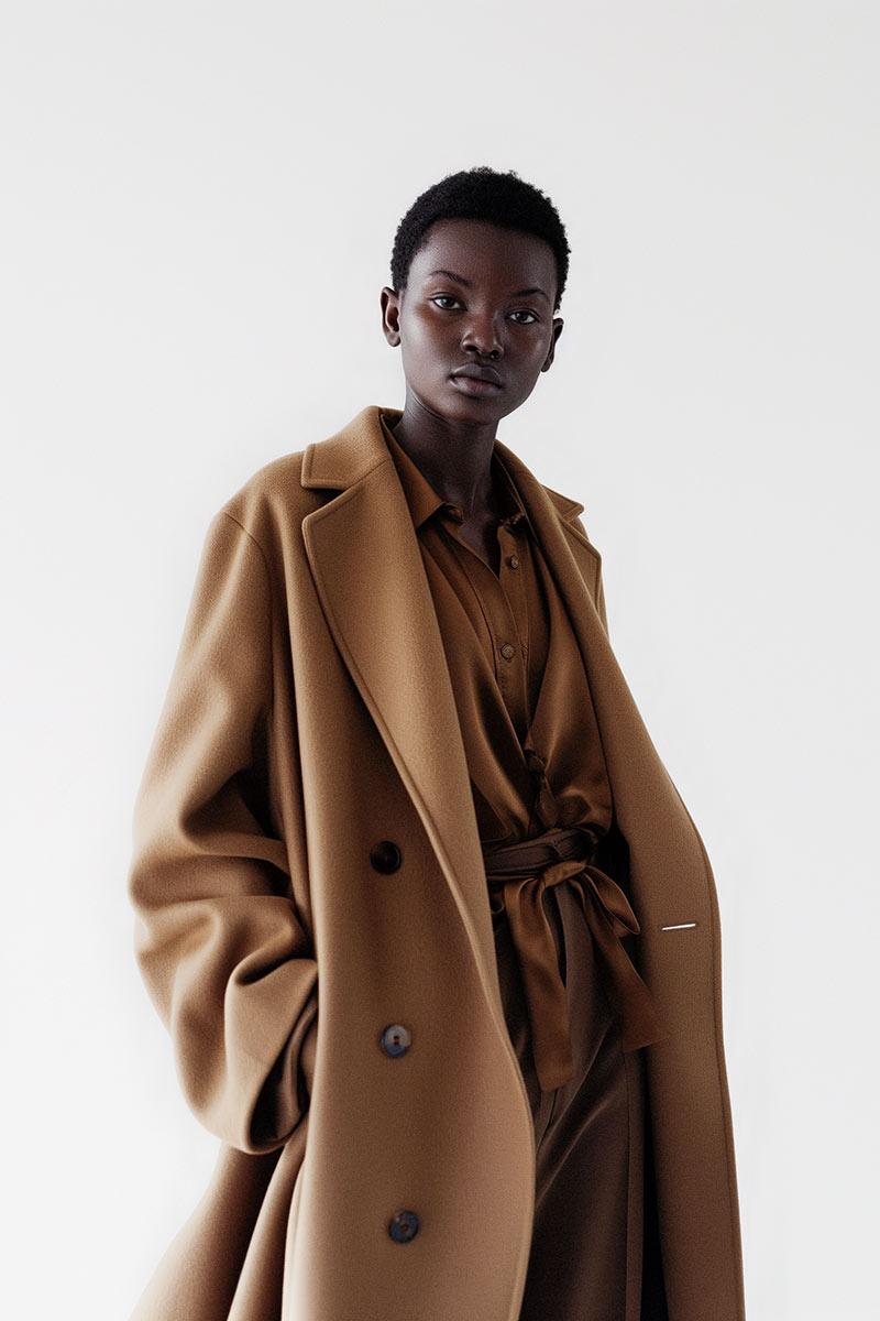
Professional photography ensures your images match your visual rules — consistent lighting, colour treatment and composition all reinforce your identity. Brands that invest in professional shoots find their campaigns land better with audiences, driving more engagement and conversions. At EyeMedia Studios we tailor shoots so every image fits your visual system and strengthens your story.
Working with specialist photographers brings clear advantages:
Many brands have used consistent photography to boost recognition and trust. Airbnb, for example, uses imagery that feels authentic and consistent across touchpoints. Nike’s campaigns rely on powerful, consistent visuals that communicate performance and aspiration. These examples show how disciplined imagery creates stronger emotional bonds with customers.
Results like higher engagement, more shares and better conversion rates show the value of a unified visual approach. Brands that commit to professional photography often see improved website traffic, social growth and stronger sales. Tracking these metrics gives clear evidence that consistent visuals deliver business impact.
Good preparation makes a shoot efficient and effective. Try these steps:
Pricing depends on project scope — shoot length, locations, number of final images and post‑production. EyeMedia Studios offers flexible packages to suit different needs and budgets. Talk to us about your brief and we’ll outline options and timelines so you can plan confidently.
To sum up, consistent visuals are a strategic asset. When your visual identity is well defined and supported by professional photography, your brand becomes easier to recognise, trust and choose. Investing in clear guidelines and quality imagery pays off through better engagement and a stronger reputation in the market.
A consistent visual identity makes your brand memorable and trustworthy. It helps you stand out from competitors, communicates your values clearly, and builds familiarity that encourages customer loyalty. When your visuals are consistent across channels, audiences recognise you faster and engage more readily.
Most brands refresh their visuals every five to ten years, or when there’s a significant change in strategy, audience or market position. Smaller, targeted updates — like tweaking colours or refining typography — can keep your brand current without losing established recognition. Regular reviews help you decide whether a refresh is needed.
Colour influences how people feel about your brand. For example, blue often communicates trust, while red can create urgency or excitement. Choosing colours that match your brand personality and audience expectations helps reinforce your messaging and improve emotional resonance.
Measure performance with brand recognition surveys, customer feedback and digital metrics such as engagement, website traffic and conversion rates. Tracking social shares, time on page and sales before and after a visual update gives practical insight into how well your visual identity is working.
Look at a photographer’s portfolio to check style and consistency. Ask about their experience with branding, collaboration approach and how they handle post‑production. Also consider budget, availability and whether they can deliver the types of assets you need for your channels.
Yes — professional photography helps small businesses look more polished and credible. High‑quality images lift your website, social media and marketing materials, making it easier to attract customers and build trust. The investment often pays back through stronger engagement and improved sales.